Antithesis

- Client:mySpot
- Duration:October, 2019 - June, 2020
- Role:Lead Design & Development
- Status:Offline
- Link:https://myspot.io/
- Tools:Sketch, FramerX
About
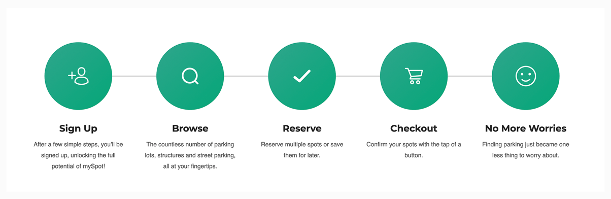
mySpot is an all-purpose parking services application. The goal of this application is to make parking seamless and more convenient for users. Its search paradigm features all available parking relative to the user's location.
This app's premise is to solve the rampant parking issue, especially in urbanized cities - parking. With mySpot, we seek to resolve or at least mitigate this problem.
Research
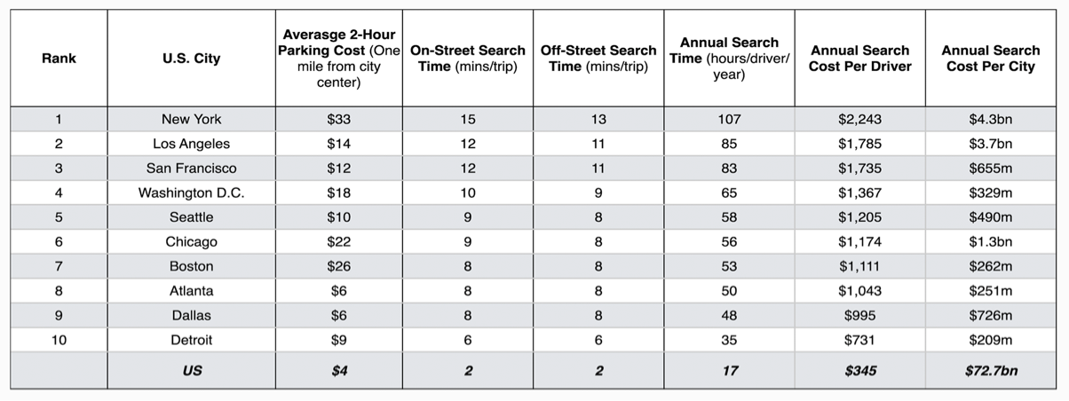
INRIX, a transportation analytics company, surveyed 6,000 U.S. drivers regarding the parking dilemma here in the U.S. They found that Americans waste more than 20 billion dollars annually on overpaying for parking. 63% of the 6,000 who were surveyed said they avoided driving somewhere due to parking challenges.
The average time spent looking for parking across the U.S. is 17 hours, which costs an average of $345 per driver—adding up the top ten cities' annual cost sums to 72.7 billion dollars.
Information Architecture
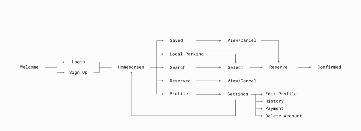
Below is a user flow diagram giving a general mapping of the application’s flow. Although it may seem convoluted, the experience is seamless thanks to the interface design.
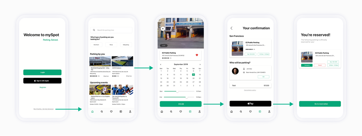
Wireframing
With the logistical measures taken care of, we now have an excellent framework to base the wireframes.
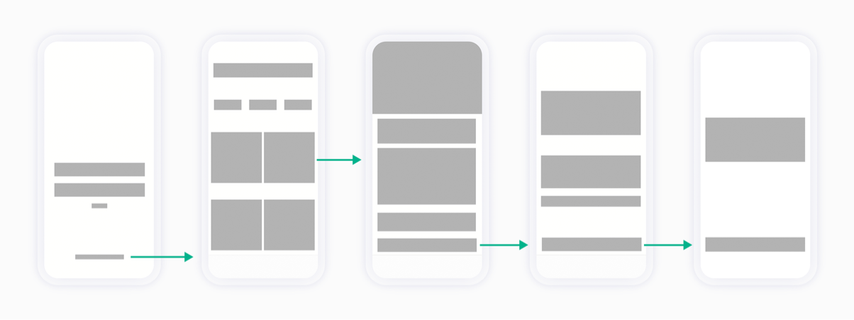
The following screens will give a visual representation of the "Welcome" screen up to the "Confirmed" screen.
The wireframe should illustrate our philosophy in which we try to mitigate the number of clicks and navigational interactions required for the user to reach the end state.
In this example, the user decides to bypass logging in and opts to log in during the fourth screen—the "Confirmation of Information" screen.
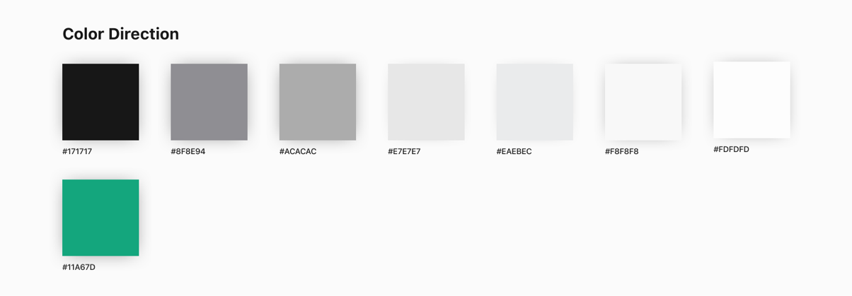
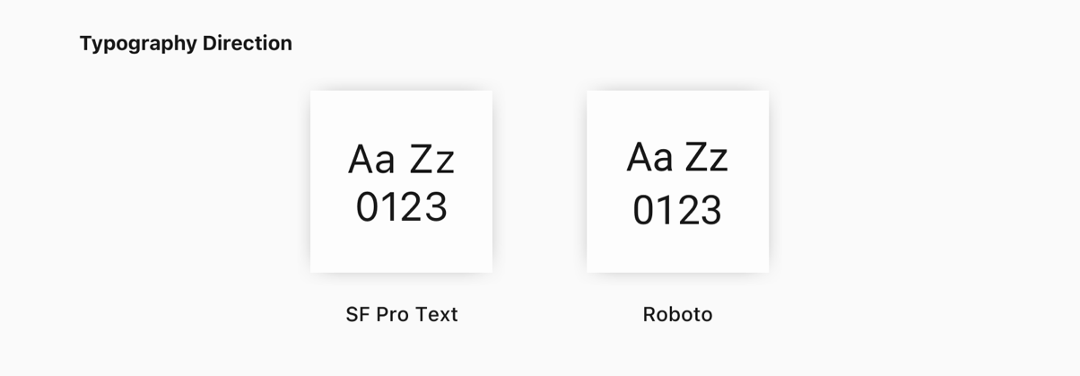
Design Direction
Below are our decisions on the direction of design.
For color, several different shades were utilized. The signature color we opted for mySpot was an off-shade green. The decision for this color was that green often represents balance and harmony, psychologically. Considering parking can be viewed as an inconvenience, especially during holidays, green symbolizes the relief of a burden through using this app.
Most, if not all, typography remained greyscale. We decided to utilize familiar typefaces that have a proven track record of legibility and accessibility.
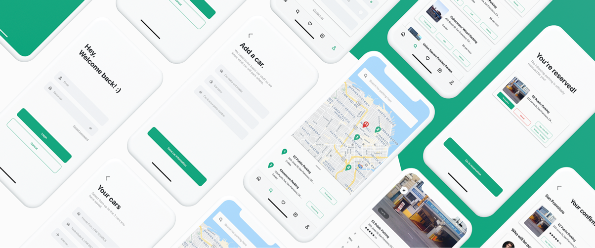
Using the same sequence of screens from the wireframing section, this is how the three-screen sequence appears with completed visuals.
Visual Design
Below are several completed screens to help encapsulate the design approach we used for Rerent.
Insights
This was an exciting project to work on. Having more time to work out a few details would have the project ready for full-scale development. However, as it sits, this remains a “concept”.
With that in mind, over the course of 2021, this project will be re-opened for design iterations.
In regards to development, we are planning on using Agile methodologies with a focus on SCRUM.